Advanced Analytics: Overall Score Analysis Report
The Overall Score Analysis Dashboard report gives you the average score information for completed appraisals.
The Overall Score Analysis Dashboard report gives you the average score information for completed appraisals only.
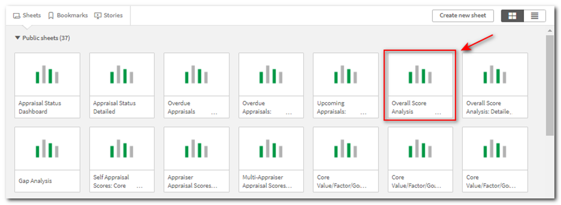
Upon opening Advanced Analytics (and running the Performance Pro V2.0 App), the overview of the standard sheets displays. Click on the Overall Score Analysis Dashboard sheet.
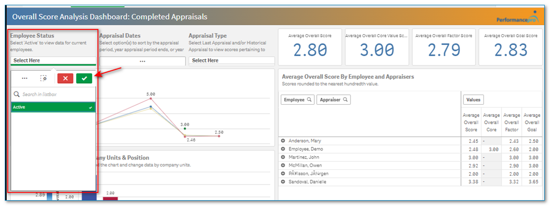
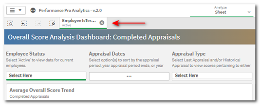
Click on the Employee Status “Select Here” box, click Active, then the green checkmark. This will filter the data based on active employees. Once selected, the filter will appear above the dashboard until it is removed. The filter will also stay if you move to another sheet.
Click on the Appraisal Type “Select Here” box, click Historical Appraisal and Last Appraisal, then click the green checkmark if you wish to look at appraisals that have been completed and have a final score.

The “Appraisal Dates” filter allows you to drill down by selecting an Appraisal Review Period, Appraisal End Year, or Appraisal Due Year. If an “Appraisal Dates” filter is not chosen you will be viewing the averages of all appraisals.
Click on the “Appraisal Dates” options box. The Appraisal Dates options will display.

Click on the desired option and then choose from the list of dates that display. Selecting an end year will grab all appraisal review periods for that end year.

You will now see the Average Overall Score displays in the top right corner. Averages also display separately by evaluation criteria (Core Values, Factors/Competencies, Goals) if applicable. Scores are rounded to the nearest hundredths value.
Note: The individual Overall Average Scores only factor in appraisals where that data was present. If an appraisal does not have Core Values, Factors or Goals, it does not affect the average.

In the “Average Overall Score Trend” box click the arrows in the top right corner to expand to full screen view. This will display additional info to help interpret the graph.
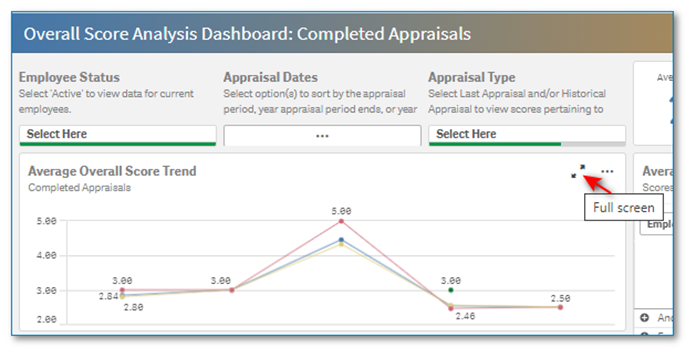
Note: Depending on the browser you are using, you may not automatically see the expansion arrows. If applicable, hover or right click in the box to display the options.

If the data is based on multiple years, it is easy to see the trends over the years. Blue is for Average Overall Scores, green is for Core Values, yellow is for Factors/Competencies, and red is for goals.

You can use the selector at the bottom-center of the chart to choose a different date format.

In the “Average Overall Score by Company Units & Position” chart click the arrows to expand to full screen view.

You can use the selector at the bottom-center of the chart to display the data by a different company unit (Department, Division, Location) or by the employee’s position.

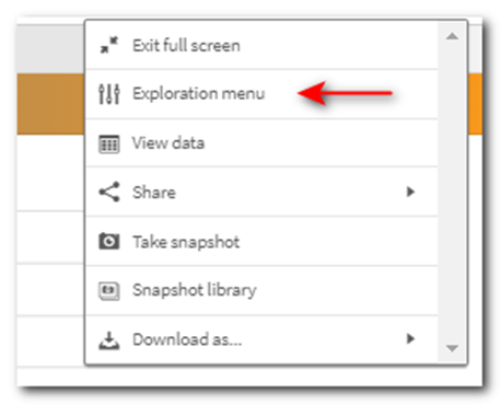
You can use the Exploration menu on any visualization to manipulate how the data appears. This menu is accessed by clicking the … on the right side of the visualization and then choosing Exploration menu.

The Exploration menu will open on the right side of the screen. Click on Sorting, Presentation, or Colors and legend at the bottom for options to change the appearance of the chart.
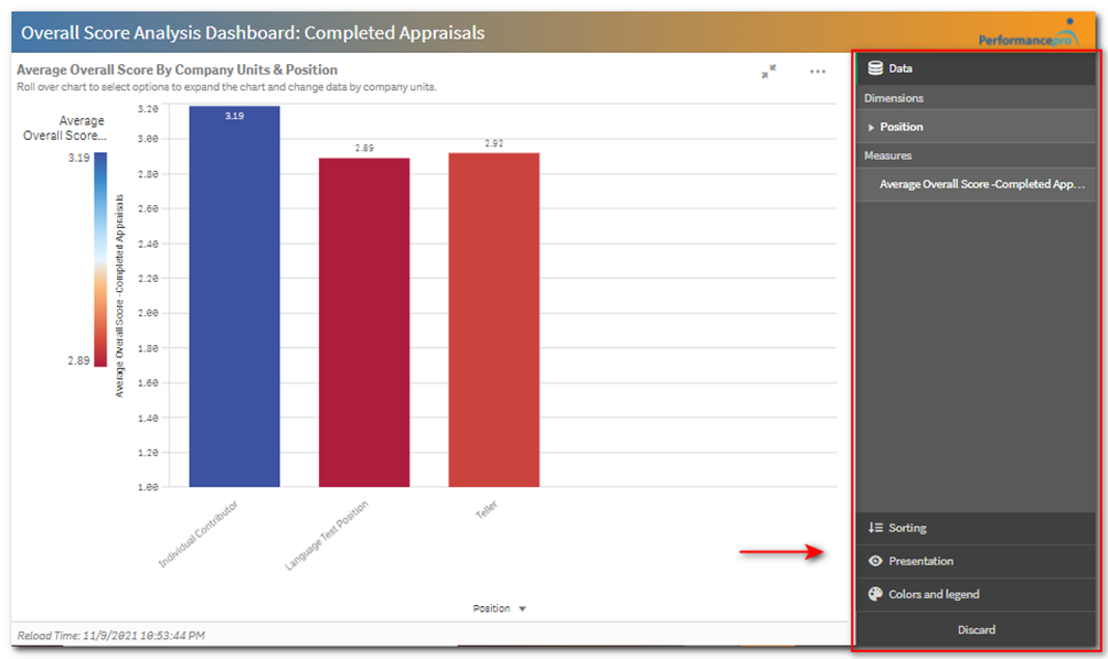
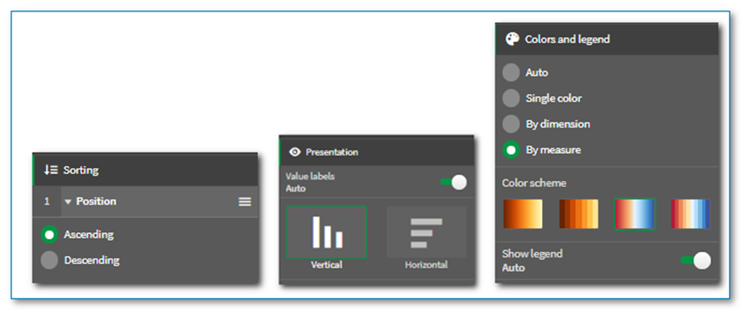
Any changes you make using these options can be removed by clicking Discard at the bottom of the Exploration menu.
Note: You can create a bookmark once you get the filters set up the way you desire. This will enable you to quickly return to the desired state later. (See article titled “How to Create a Bookmark” for more information.)
The “Average Overall Score by Employee and Appraisers” chart on the right side of the screen displays employee and appraiser information along with their average overall scores.
Note: Scores displayed are always dependent on the appraisal period(s) selected. If you select multiple appraisal periods or years, the scores displayed will be an average of those time periods.

Clicking the plus sign beside an employee’s name will display that employee’s appraiser to the right.

Clicking the right arrow at the top of the screen will take you to the next report which is “Overall Score Analysis: Detailed.” This report will give additional information related to the average overall scores.
Note: Remember, your filters will carry over into this new report.

The “Overall Score Analysis: Detailed” report displays additional information including:
- Period
- Performance Levels
- Appraisal Score
- Rating (Outstanding, Exceeds Expectations, Needs Improvement, etc. depending on company customization)
- Appraisal Process.
Note: Additional filtering can be performed by selecting the magnifying glass in any column header.

Note: From the Appraisal Complete Status area choose “Yes” to view only appraisals that have been marked “Complete.” This will display Last and Historical Appraisals. If you choose “No” you will be viewing open appraisals only. If you do not make a selection, you will be viewing all appraisals. If you choose to view open current appraisals, keep in mind that they are not closed to changes. Some may be incomplete, and scores may change while the appraisal moves through the appraisal process.

The “Employee Percentage by Rating” box displays a pie chart with the percentages by rating. Hovering over the pie chart sections will display the number of employees who make up that percentage. Click on the arrows in the visualization to expand it to full screen, if desired.

![HRPS Logo1.png]](https://knowledgebase.hrperformancesolutions.net/hs-fs/hubfs/HRPS%20Logo1.png?height=50&name=HRPS%20Logo1.png)