Advanced Analytics: How Do I Access the Reports (Sheets) and Run a Report?
Upon opening Advanced Analytics (and running the Performance Pro V2.0 App), the overview of the standard sheets displays. You can think of a “sheet” as a report. These terms can be used interchangeably. The screen displays the individual sheet dashboards in grid view by default.
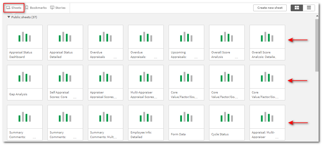
If desired, click on the List View button to change the display to a list. This view will display a description of the reports’ contents, filter options, and tips.
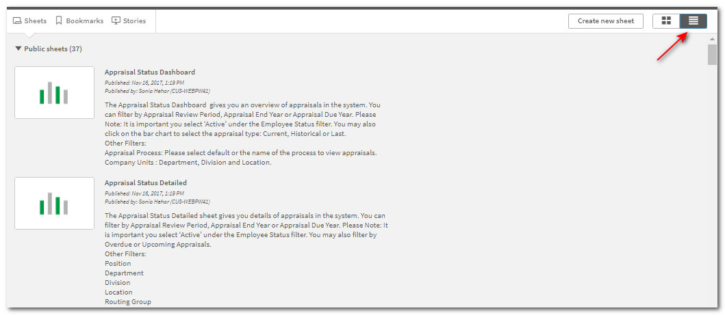
In grid view, you can hover over the report title and the information icon will display. Click on it to display a description of the reports’ contents, filter options, and tips.
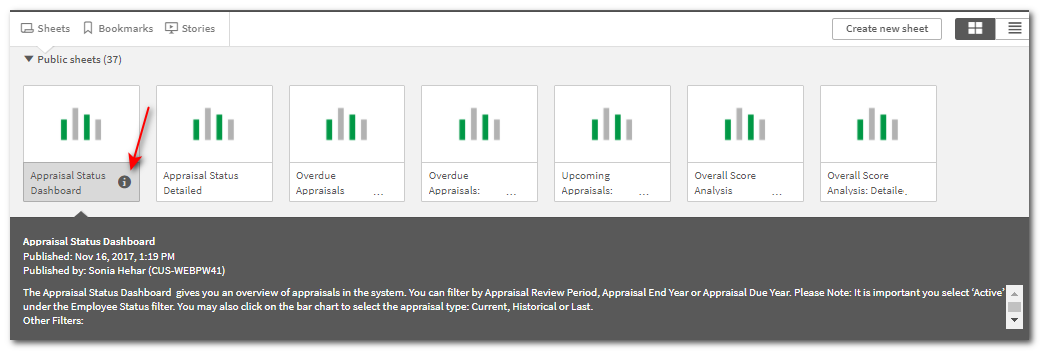
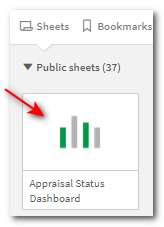
Click on the graph of the individual report, above the report name, and the full report will open.
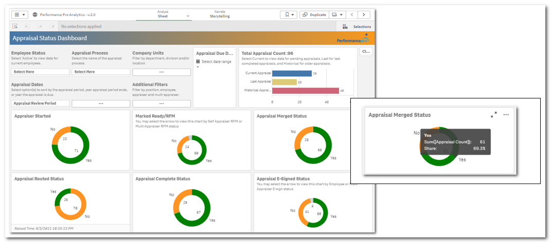
Upon opening, the visualizations of the data display generally in individual graphs and donut charts. The number and type of visualizations will vary depending on the report selected. Hovering over elements of the graphs and charts will display additional information. You can now begin to apply filters to customize the report to drill down and report on the specific information you are looking for.
Note: Any time you wish to return to the overview of standard sheets, click the Navigation button and then App overview.

Filtering Data
One way to manipulate the data displaying in the visualizations is by applying filters from the top left of the dashboard. Available filters will change based upon the Sheet selected. As filters are applied, the visualizations will dynamically change.
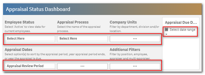
Report Filter Explanations
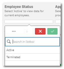
Employee Status: When no filter is applied here, the visualizations will include active and terminated employees. To only display active employees, choose Active. To only display terminated employees, choose Terminated.
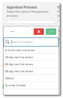
Appraisal Process: If you are utilizing the Concurrent Appraisals feature, you can filter by any of your appraisal processes or by the default appraisal.
Company Units: Clicking this filter will open a full screen of your Departments/Locations/Divisions. Clicking on any of these company unit titles will open a filter box where you can select a specific company unit to filter by.


When finished with selections to include, click the green check mark button. Click the red X button to close the filter without making any selections.
Note: On full screens, click the Exit Full Screen arrows icon to return to the Dashboard.

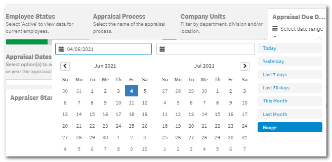
Appraisal Due Date: You can filter data according to appraisal due dates. You can choose a specific date on the calendar or choose Today, Yesterday, Last 7 days, Last 30 days, This Month, Last Month, or enter a specific date range.
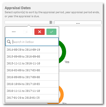
Appraisal Dates: The Appraisal Dates filter is very important to ensure you are pulling the desired data. Clicking the first filter box allows you to filter by review period.
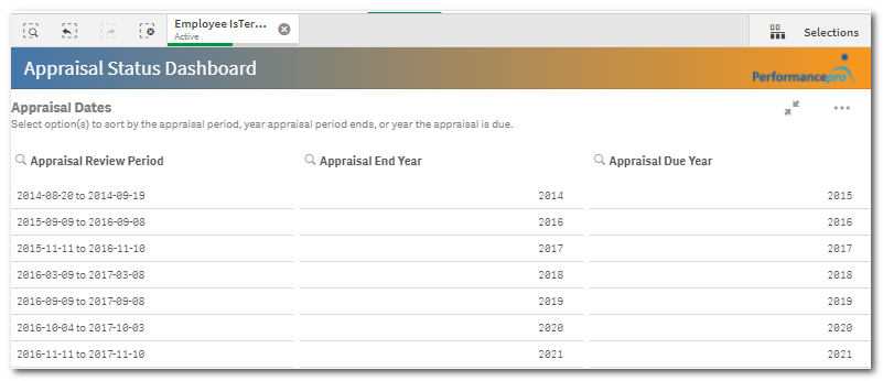
Clicking the second filter box will open a full screen that includes Appraisal Review Period, Appraisal End Year, and Appraisal Due year filters. Click on any of these screen contents to open a filter box and make selections.
Additional Filters: Clicking in this filter box will open a full screen with additional filtering options.

Filters Applied
Once a filter is applied, it will appear above the Dashboard title bar. You can click the X to remove the filter from the report. You can also access the filter and make changes to it by clicking on it from this toolbar.
Note: If the filter appears in this toolbar it will apply to whichever sheet you are viewing. So, if you go to a different sheet, previously selected filters in the toolbar will affect the data displayed on the new sheet.
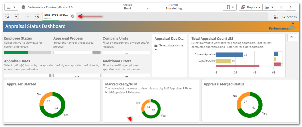
Filtering by a Graph or Donut Chart
Individual donut charts and graphs can also be used to filter information on the report.

Note: Gray sections of a donut chart indicate employees with missing information that is affecting the chart. (Example: missing appraiser assignment)
Clicking on elements in the graph at the top right of the dashboard will instantly filter by that element and change the data displayed in the donut charts. If you wish to keep this filter, click the green check mark. If not, click the red X.
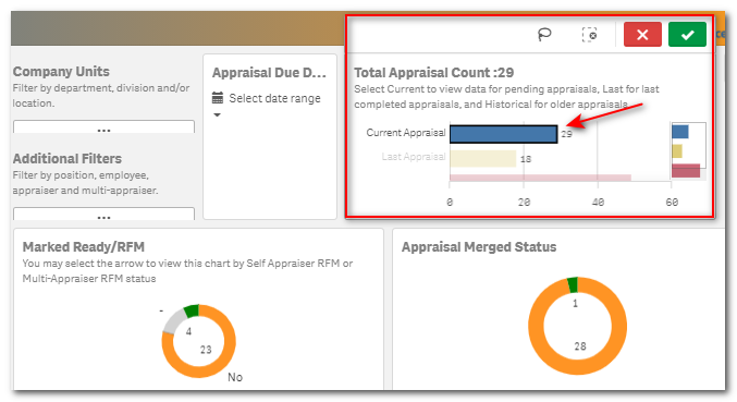
Click on any element of a donut chart and it will open to allow you to filter by that element of the chart. Selections made can affect all other visualizations on the report, if applicable.

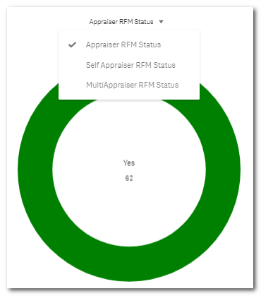
Some charts offer additional filter instructions below the chart title. Clicking the full screen arrows will expand the chart and display the additional filter options.
Note: Chart filters only affect the selected chart.
See articles on Bookmarks, which save all your filters, and Exporting and Downloading for instructions on what to do with the report once you have it filtered.
Did this answer your question?![HRPS Logo1.png]](https://knowledgebase.hrperformancesolutions.net/hs-fs/hubfs/HRPS%20Logo1.png?height=50&name=HRPS%20Logo1.png)